React Tabs Component that supports Swiping across screen to switch tabs.
Easy to incorporate and highly customizable Tabs Component for React, where tabs can be switched by swiping across the screen, as well as the conventional clicking on tab names way. Supports all types of devices.
Following Peer Dependencies are required for using this library:
npm install @tarragon/swipeable-tabs --save
or
yarn add @tarragon/swipeable-tabs
Checkout the basic usage here.
Various customisations can also be added to the component like this.
Make sure to have a state variable to determine the current selected Tab
const [selectedTab, setSelectedTab] = React.useState(0);const changeTab: (selectedTab: {label: string;key: string | number;}) => void = updatedTab => {setSelectedTab(updatedTab.label);};
Import the Tabs component and pass the current selected tab value to it, along with onChange callback.
A number of Tab components can be passed as children of the Tabs component, to represent each of the tabs.
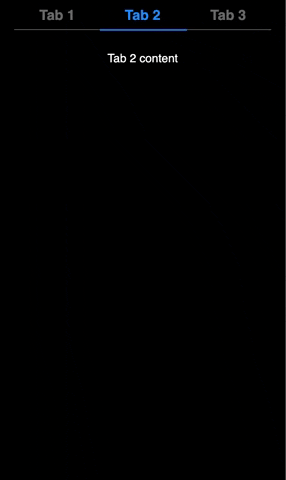
<Tabs value={selectedTab} onChange={changeTab}><Tab label="Tab 1" key={0}><div>Tab 1 Content</div></Tab><Tab label="Tab 2" key={1}><div>Tab 2 content</div></Tab><Tab label="Tab 3" key={2}><div>Tab 3 content</div></Tab><Tab label="Tab 4" key={3}><div>Tab 4 content</div></Tab></Tabs>
<Tabs ></Tabs>
import { Tabs } from "@tarragon/swipeable-tabs";
| Name | Type | Default | Description |
| value | string | - | Label of the current selected tab. |
| onChange | function | - | Tab change handler, return type: void, that receives the changed tab details, { label: string; key: string | number } |
| styleProps | | { | Design customisations |
| tabBarCSS | string | “” | Stringified CSS to further customise the tab bar. example, tabBarCSS = |
| tabItemCSS | string | “” | Stringified CSS to further customise individual tab item in the tab bar. example, tabItemCSS = |
| blacklistedElement | { | undefined | Enables blacklisting certain nodes where swipe action would be disabled. Can be used if a tab content has a horizontal scrolling element. |
<Tab ></Tab>To be passed as child of Tabs component, where each <Tab></Tab> represents single tab, with its innerHTML as content of the tab
import { Tab } from "@tarragon/swipeable-tabs";
| Name | Type | Default | Description |
| label | string | - | Label of individual tab item. |
<SwipeableViews ></SwipeableViews>A Swipeable views component, that receives an array of elements as views, and enables horizontal swiping between them.
import { SwipeableViews } from "./@tarragon/swipeable-tabs";
| Name | Type | Default | Description |
| views | JSX.Element[] | - | An array of elements, to be treated as views. |
| selectedView | number | 0 | Index of the view visible by default |
| onSwipe | (selectedTab: number) => void | - | Callback function to be invoked on swipe between tabs. selectedTab is index of the view currently visible. Should update the selectedView prop. |
| inkBarRef | React.RefObject< HTMLHRElement> | - | Ref to an HR eleemnt, that can be used as an inkBar to denote position of current visible view |
| blacklistedElement | { | undefined | Enables blacklisting certain nodes where swipe action would be disabled. Can be used if a tab content has a horizontal scrolling element. |
Distributed under the MIT License. See LICENSE for more information.
