Using this library, You can add widgets which have, on/off button, label, description, icon and unit.
Using this library, You can add widgets which have, on/off button, label, description, icon and unit.


composer require hgh/yii-advance-input
There are 4 widget. There are common and specific options that widgets can use them that we will see them in future.
This widget will provide a HTML input tag with type of text.
<?phpecho Text::widget(["name" => "test-name"]);?>
This widget will provide a HTML input tag with type of checkbox.
<?phpecho Checkbox::widget(["name" => "test-name"]);?>
This widget will provide a HTML select tag.
This widget needs another required option which is called items. The items array is a map for select datalist. In another word, key of array elements will be value of option tag and value of array elements will be option tag value. See bellow:
<?phpecho Dropdown::widget(["name" => "test-name","items" => ["option1" => "value1","option2" => "value2"]]);?>
will produce:
<select id="test-name" name="test-name"><option value="option1">value1</option><option value="option2">value2</option></select>
This widget will provide a HTML textarea tag.
<?phpecho Textarea::widget(["name" => "test-name"]);?>
Main common options that all widgets can use is listed below.
The main name of input which will place into name attribute of input.
<?phpecho Text::widget(["name" => "test-name"]);?>

optional
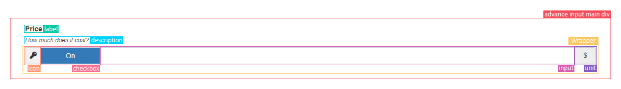
The icon class which will appear in a box right before input. This is a class attribute which will add to a i element.
<?phpecho Text::widget(["name" => "test-name","icon" => "fas fa-key"]);?>
Every input will accept specific values. Using this option, a unit box will append to input.
<?phpecho Text::widget(["name" => "test-name","icon" => "fas fa-key","unit" => "$"]);?>

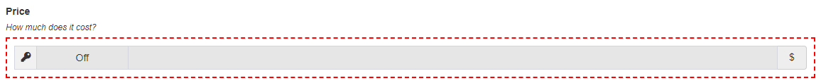
Using this option, you provide an option which allows users to not filling input. If checkbox is not checked, an disabled attribute will add to input.
Noticeunit options will not work on this type of widget.
<?phpecho Text::widget(["name" => "test-name","icon" => "fas fa-key","unit" => "$","checkbox" => true]);?>

A label for input.
<?phpecho Text::widget(["name" => "test-name","icon" => "fas fa-key","unit" => "$","checkbox" => true,"label" => "Price"]);?>

If you want to describe what the field is for, you can use this option. Using this option, an div will add after label.
<?phpecho Text::widget(["name" => "test-name","icon" => "fas fa-key","unit" => "$","checkbox" => true,"label" => "Price","description" => "How much does it cost?"]);?>

A map of attributes and their values for wrapper.
<?phpecho Text::widget(["name" => "test-name","icon" => "fas fa-key","unit" => "$","checkbox" => true,"label" => "Price","description" => "How much does it cost?","wrapperOptions" => ["style" => "border: 2px dashed red; padding : 10px;"]]);?>
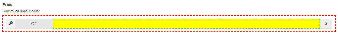
A map of attributes and their values for input.
<?phpecho Text::widget(["name" => "test-name","icon" => "fas fa-key","unit" => "$","checkbox" => true,"label" => "Price","description" => "How much does it cost?","wrapperOptions" => ["style" => "border: 2px dashed red; padding : 10px;"],"inputOptions" => ["style" => "border: 2px dashed green; background: yellow;"]]);?>
A map of attributes and their values for checkbox input.
Notice
Checkbox use bootstrap toggle. All options of Bootstrap Toggle is supported. Visit Bootstrap Toggle.
<?phpecho Text::widget(["name" => "test-name","icon" => "fas fa-key","unit" => "$","checkbox" => true,"label" => "Price","description" => "How much does it cost?","checkboxOptions" => ["data-on" => "enabled", "data-off" => "disabled"]]);?>

These widgets can also receive Yii2 models. By passing your model into this option, elements will generate using form option that you provided. form option must be an instance of ActiveForm of Yii2. For more information visit: ActiveForm
Notice
By using model option, label will generate automatically. It use attributeLabel of property of model. If there is no label, label box will not generate. Also to prevent of label generation even if attributeLabel in model exists, set label option to false.
<?php$form = ActiveForm::begin();$user = new User();$user->username = "john.smith";echo Text::widget(["name" => "username","icon" => "fas fa-user","model" => $user,"form" => $form]);?>

This widgets, also support rtl pages. To use these as a rtl widget, just set rtl option true;
<?phpecho Text::widget(["name" => "test-name","icon" => "fas fa-key","unit" => "$","checkbox" => true,"label" => "Price","description" => "How much does it cost?","checkboxOptions" => ["data-on" => "enabled", "data-off" => "disabled"],"rtl" => true]);?>
The items array is a map for select datalist. In another word, key of array elements will be value of option tag and value of array elements will be option tag value
Notice
Checkbox use bootstrap toggle. All options of Bootstrap Toggle is supported. Visit Bootstrap Toggle.
<?phpecho Dropdown::widget(["name" => "test-name","icon" => "fas fa-key","unit" => "$","checkbox" => true,"label" => "Price","description" => "How much does it cost?","checkboxOptions" => ["data-on" => "enabled", "data-off" => "disabled"],"items" => ["option1" => "value1", "option2" => "value2"]]);?>
