An opinionated React Native UI component library
react-native-uix is an opinionated React Native UI component library that gets you up and running in minutes.
Using npm:
npm install react-native-uix
or with yarn:
yarn add react-native-uix
This project has several project peer dependencies. A few of these include:
Refer to the project package.json file to view all required peer dependencies.
To install all of these peer dependencies quickly, from the terminal in your project directory run the shell script:
bash node_modules/react-native-uix/install.sh
This will install the peer dependencies after choosing your desired package manager.
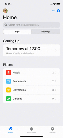
The best way to see react-native-uix in-action, is to take a look at the example!
import { ThemeProvider, useStyle, LayoutTopLevelScreen, GroupedTable } from "react-native-uix";function HomeScreen() {const { themeSet } = useStyle();const tableItems = [{id: 0,label: "Hotels",count: 2,iconBackgroundColor: themeSet.red,icon: faBuilding,onPress: () => {},},{id: 1,label: "Restaraunts",count: 2,iconBackgroundColor: themeSet.teal,icon: faUtensils,onPress: () => {},},{id: 2,label: "Universities",count: 3,iconBackgroundColor: themeSet.yellow,icon: faUniversity,onPress: () => {},},];return (<LayoutTopLevelScreen title="Home" navigation={navigation}><GroupedTable title="Places" items={tableItems} ></GroupedTable></LayoutTopLevelScreen>);}function App() {const HomeStack = createStackNavigator();return (<ThemeProvider><HomeStack.Navigator><HomeStack.Screen name="Home" component={HomeScreen} ></HomeStack.Screen></HomeStack.Navigator></ThemeProvider>);}
Customising the theme of your app can be achieved using the ThemeProvider component. You can determine the colours for both light and dark mode.
| Light | Dark |
|---|---|
 |
 |
import { ThemeProvide } from "react-native-uix";const App: React.FC = () => {const theme = {light: {textPrimary: "#345000",tint: "#2188ff",systemBackground: "#ff0000"},dark: {textPrimary: "#345088",tint: "#388bfd",systemBackground: "#ff0055"},};return (<ThemeProvider theme={theme}><AppNavigation ></AppNavigation></ThemeProvider>);};
You can customise any of the colors below for your theme. If a color is not provided, the corresponding color in the DEFAULT_THEME is used.
tint,textPrimary,textSecondarytextTertiary,textQuarternary,systemBackground,secondarySystemBackground,tertiarySystemBackground,separator,blue,green,indigo,orange,pink,purple,red,teal,yellow,white,
If you are making your own custom components and would like to make use of your custom theme, whilst supporting dark mode, this is where the useStyle hook becomes useful.
import { useStyle } from "react-native-uix";const MyComponent = () => {const dynamicStyles = (theme) => {return {container: {width: 20,height: 20,backgroundColor: theme.systemBackground,}}}const { styles } = useStyle(dynamicStyles);return (<View style={styles.container} ></View>);};}
Pull requests are welcome. For major changes, please open an issue first to discuss what you would like to change.
Please make sure to update tests as appropriate.